
Intent, Interrupted: The UX Cost of Bad Search
Pickles.com

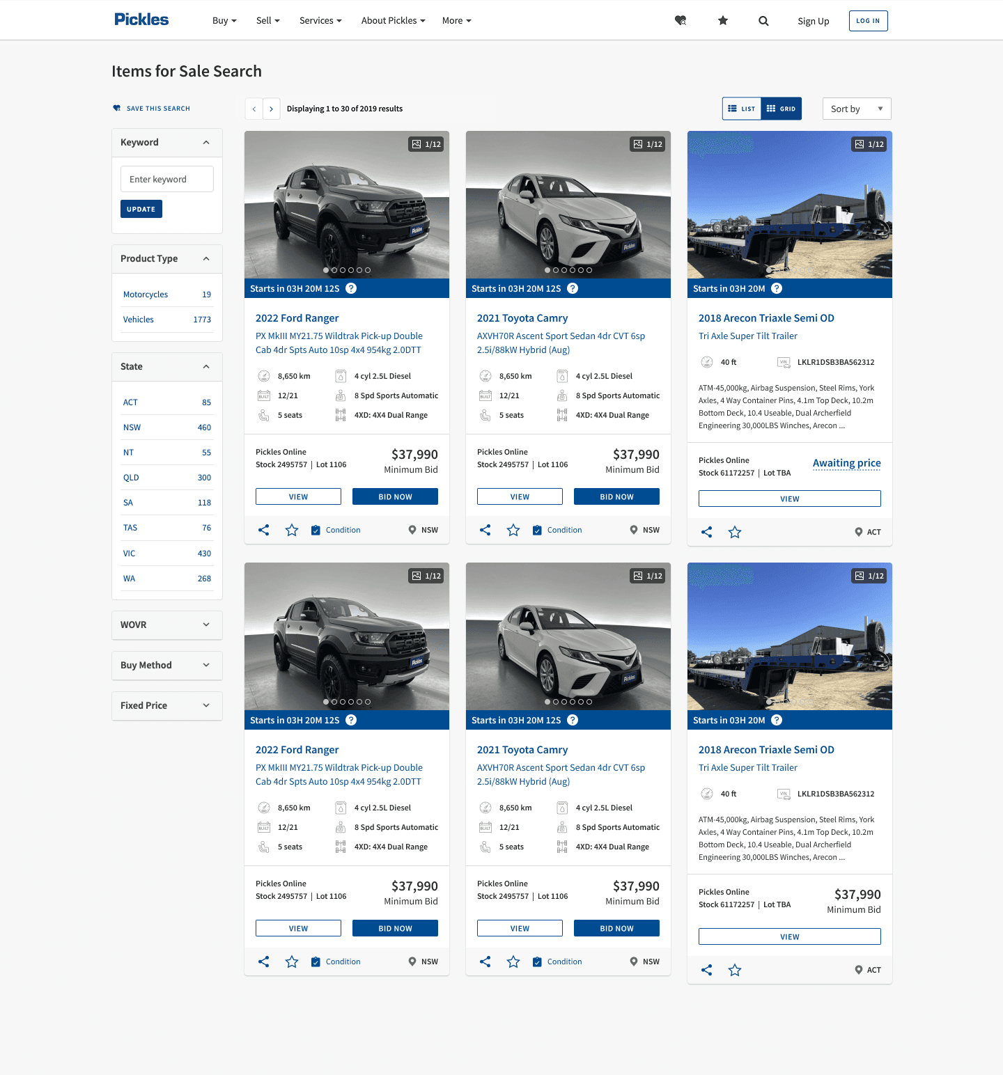
Picture this
You're ready to buy. You've got a specific item in mind — a 2016 white Ford Ranger under $10k. You hit the search bar, hopeful. What greets you is not clarity, but chaos. Irrelevant results. Confusing filters. No obvious next step.
A data-backed redesign of Pickles’ search results experience — reducing drop-off and increasing watchlist usage.
Client
Pickles Auctions Australia
Role & Responsibilities
Lead UX Designer
Interaction Designer
Design Liaison
User Insights Analyst
Industries
Automotive and Industrial
Date
June 2024


This was my UX forensics moment. After hours of combing through FullStory recordings and matching it with a heuristic deep dive, the patterns were undeniable. Users weren’t confused by chance — they were being consistently failed by design.

Grab the magnifying glass
We’ve got rage clicks, hover hesitation, and an interface full of dead ends!!
What I Found:
I was shocked by what the session recordings revealed. I thought users just weren’t engaging. Turns out — they couldn’t.
This wasn’t just poor UX. This was friction dressed as choice.
UX Clues That Changed the Investigation (Tap to reveal)
The more clues I uncovered, the clearer the full picture of friction became.

“When we stopped blaming users — and started listening to their actions — the real problems revealed themselves.”
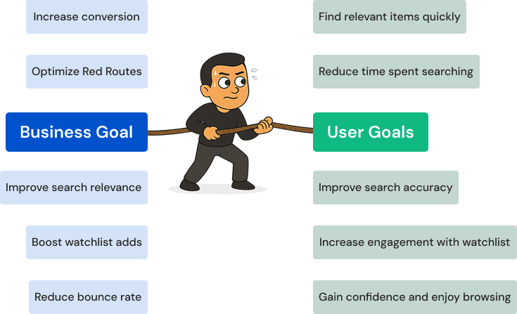
UX is often framed as a balancing act between business needs and user frustrations. But what if they’re not at odds?
What I uncovered was this: when the search works for the user, the business wins — naturally. So I mapped both sides side-by-side. Not as a conflict, but as a shared blueprint.
It wasn’t user vs business. It was alignment vs friction.
“Caught in the middle of competing forces, I had one job — design a solution that didn’t break the user OR the business.”
“Not all user flows are created equal. Some are mission-critical — and if they break, so does the entire experience.”
The Primary Red Ruote
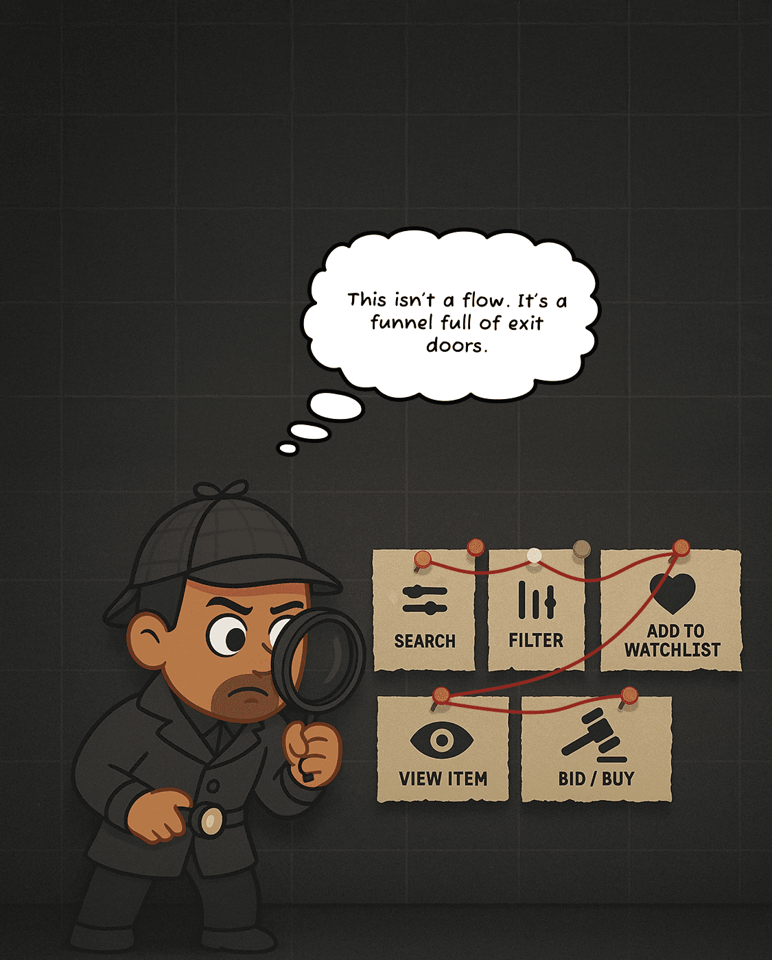


This was the lifeline of Pickles’ high-intent users — the journey they took when they knew what they wanted. But this journey was riddled with friction.
The goal wasn’t to reinvent the wheel — it was to unblock intent, reduce unnecessary decisions, and guide users forward like a well-lit highway.

My Design Philosophy at This Stage:
I started with what stopped users — and worked backward from there
Old experience

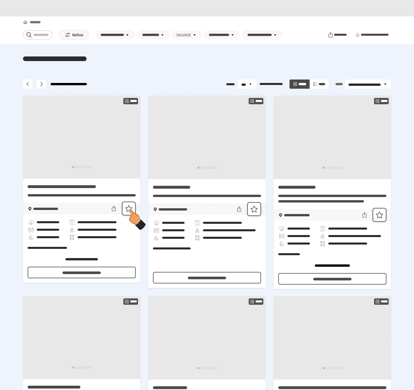
New solution
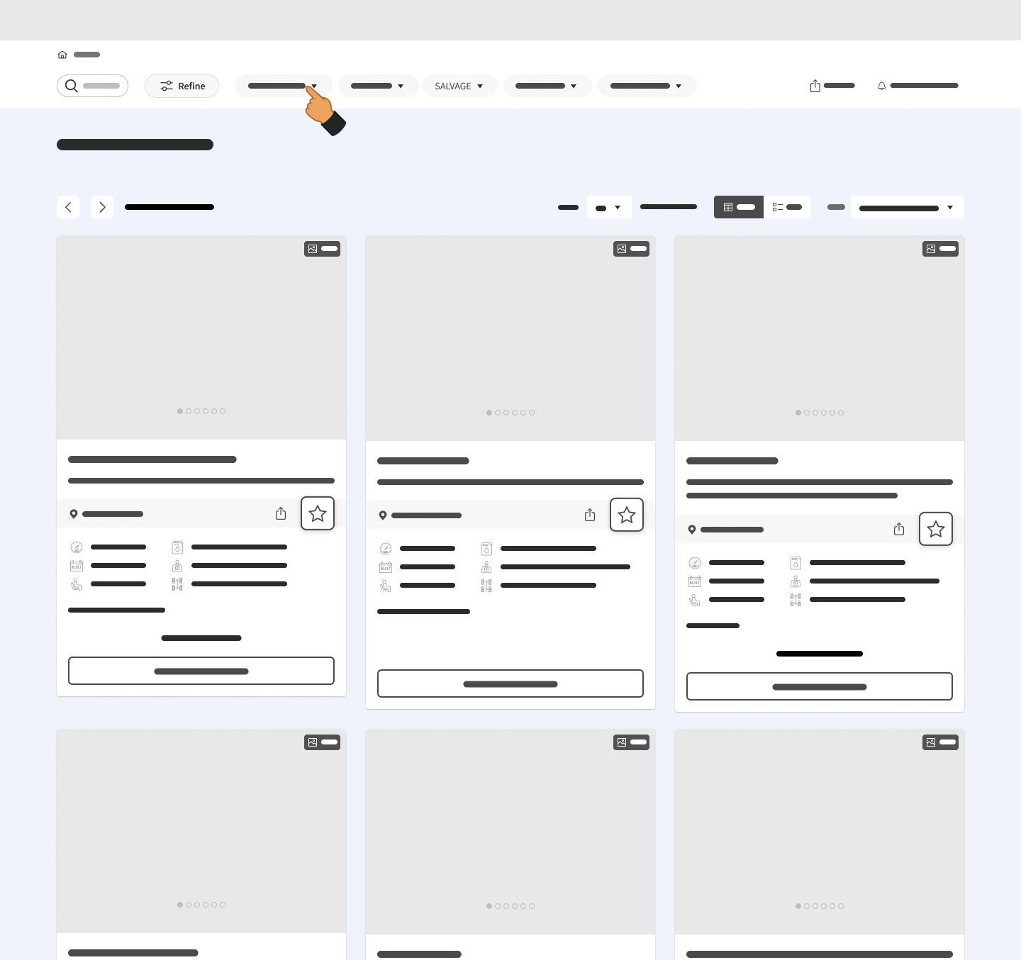
Old experience

New solution
How the New UX Solved What Was Broken?
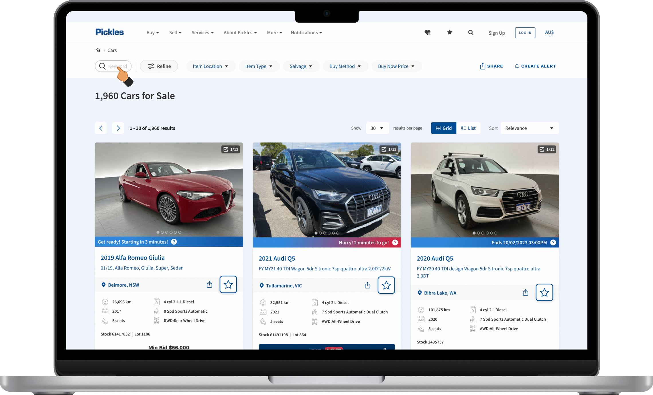
Condensed filters into top dropdowns
Made selected filters always visible with sticky top bar
Introduced modal with quick jump links
Enlarged star icon with instant feedback animation
Made selected filters always visible with sticky top bar
After uncovering the friction, it was time to move with intent.
This wasn’t about making things pretty — it was about helping users act, fast and confidently.

Friction removed. Confidence restored. But the case? Still evolving.
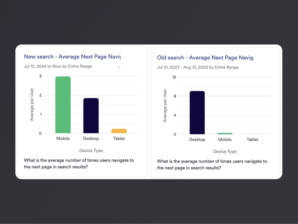
The Impact
While this redesign was grounded in evidence, the outcomes were built on clarity, not flash. Here's what changed — and why it mattered
See the difference?
That wasn’t just user clarity — that was user action.


What I’d Do Better
Every solved case reveals its next mystery. Here's what I'd revisit, refine, or explore further

This journey’s smoother now 🎉
but there’s always another flow to refine.